UX/UI DESIGN
Nike Product Page Redesign
As a solo, freelance style project, I decided to redesign the Nike Air Force product page.
Timeline
From explorations to final designs in 1 week
Background
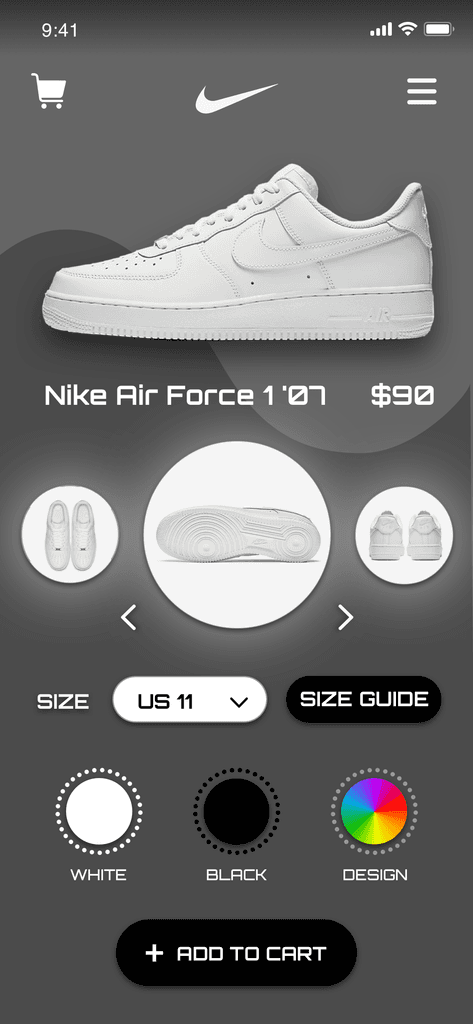
I've always admired how Nike utilizes simplicity in their overall aesthetic. However, on the Nike Air Force page I noticed an excess of white space not being utilized to its fullest extent - hence, wasted space from my perspective. So I envisioned the approach of a more modern and futuristic style.
The resulting page being one that showcases balanced flow from the product photos to the shoe sizes and colors.
Balanced Hierarchy
Previously there wasn't an evident delineation between the differing sections of visualizing the shoe, seeing the color selection, size, description, etc.
Angles, angles, angles
From performing my own user testing to competitive analysis, I've repeatedly observed shoe purchasers prioritizing the need to view the shoe from multiple angles before purchasing. This is why I emphasized those angles with a distinct outer glow effect.
Seamless and Highly Interactive Checkout
Utilizing microinteractions, animations, and overall visual distinction, I feel as though I've transformed the online shoe purchasing process from what was once very customary and standard- to one that is more engaging and fun to interact with. Which in turn, ostensibly boosts overall customer satisfaction and company profit.


